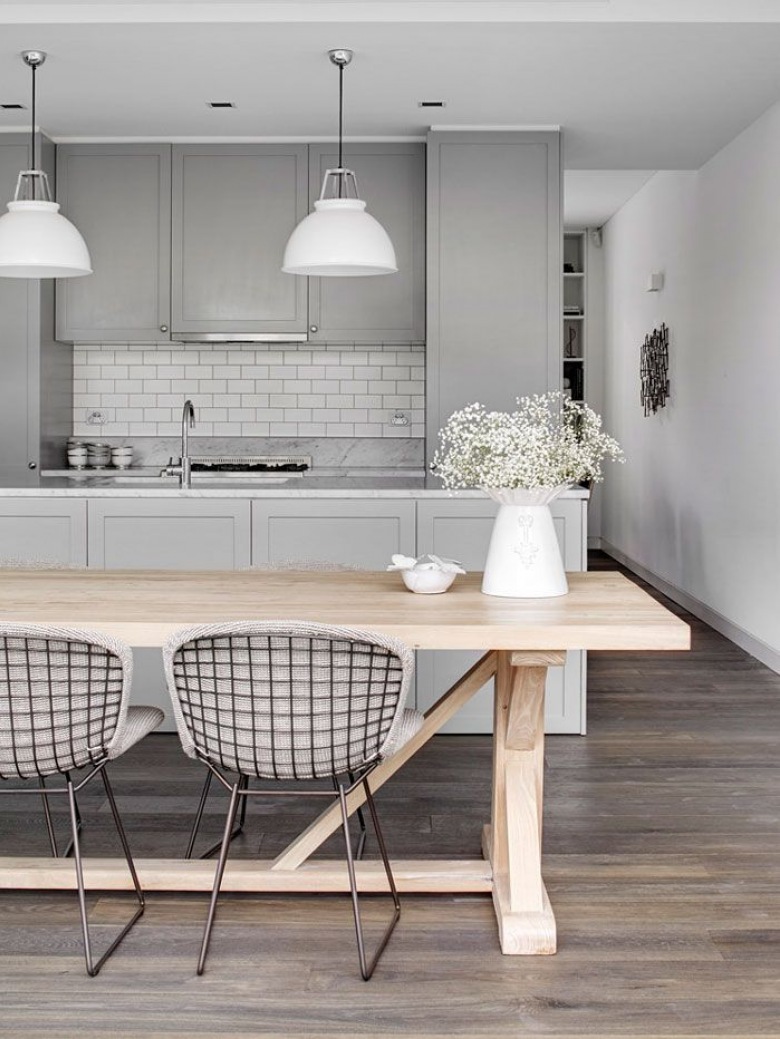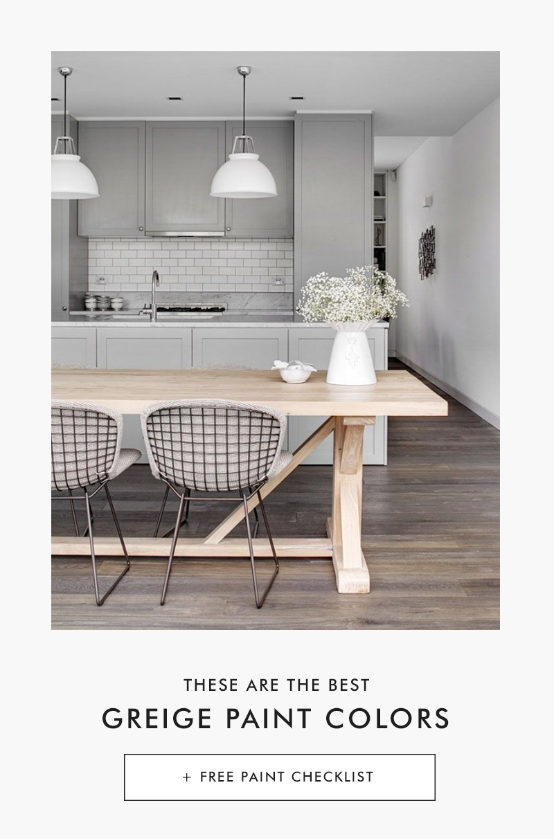
Cover Photo: Est Living Magazine
Have you been asking yourself, what color should I paint my room? With so many options the decision process can be daunting. We all want a paint color that feels modern and timeless, yet expresses our style. One that you won’t get tired of after a few months.
That’s why neutrals are the most popular color palettes in homes, and it’s easy to see why. They’re timeless, compliment a variety of styles and flattering even when you change your accessories like throw pillows.
For the perfect neutral look no further, than greiges… a beautiful balance of warm beiges and cool grays.
They’re ideal for warm and inviting rooms when you’re looking to create ambiance yet also the ideal pick for calming, serene spaces. In fact, you could say it’s an ultimate neutral.
It’s an excellent choice for anyone who’s color averse but wants something other than a white or beige while still maintaining a timeless look.
These shades won’t turn dingy… they’re the ideal neutrals for flawless color. Here are the 12 best greige paint colors around and you don’t have to take only my word for it.
FREE BONUS #1
Get your copy of the 48 BEST NEUTRAL PAINT COLORS
All the best neutral paint colors. All in one place + bonus content!
Soft Greige
Photo: Alvhem

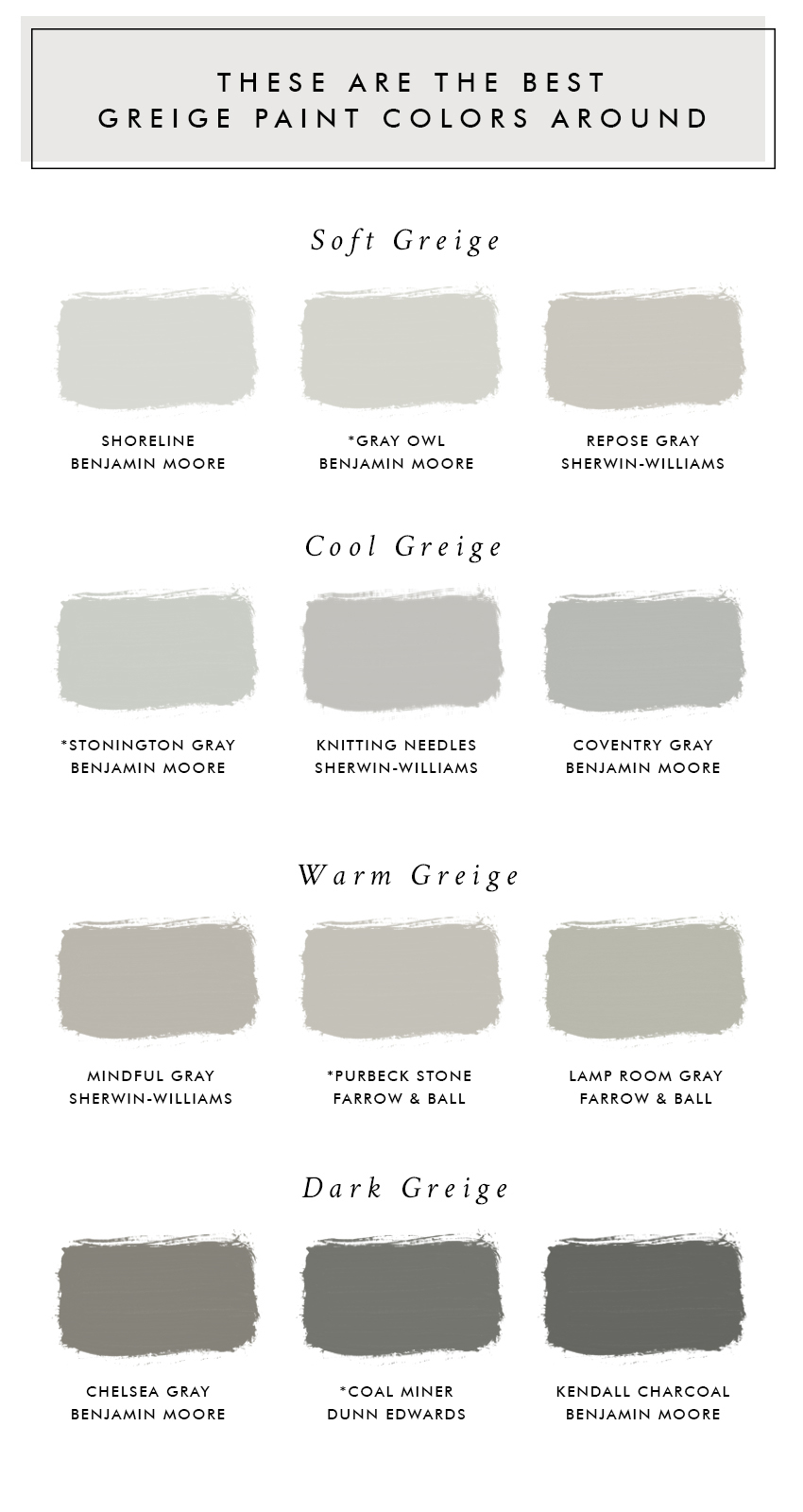
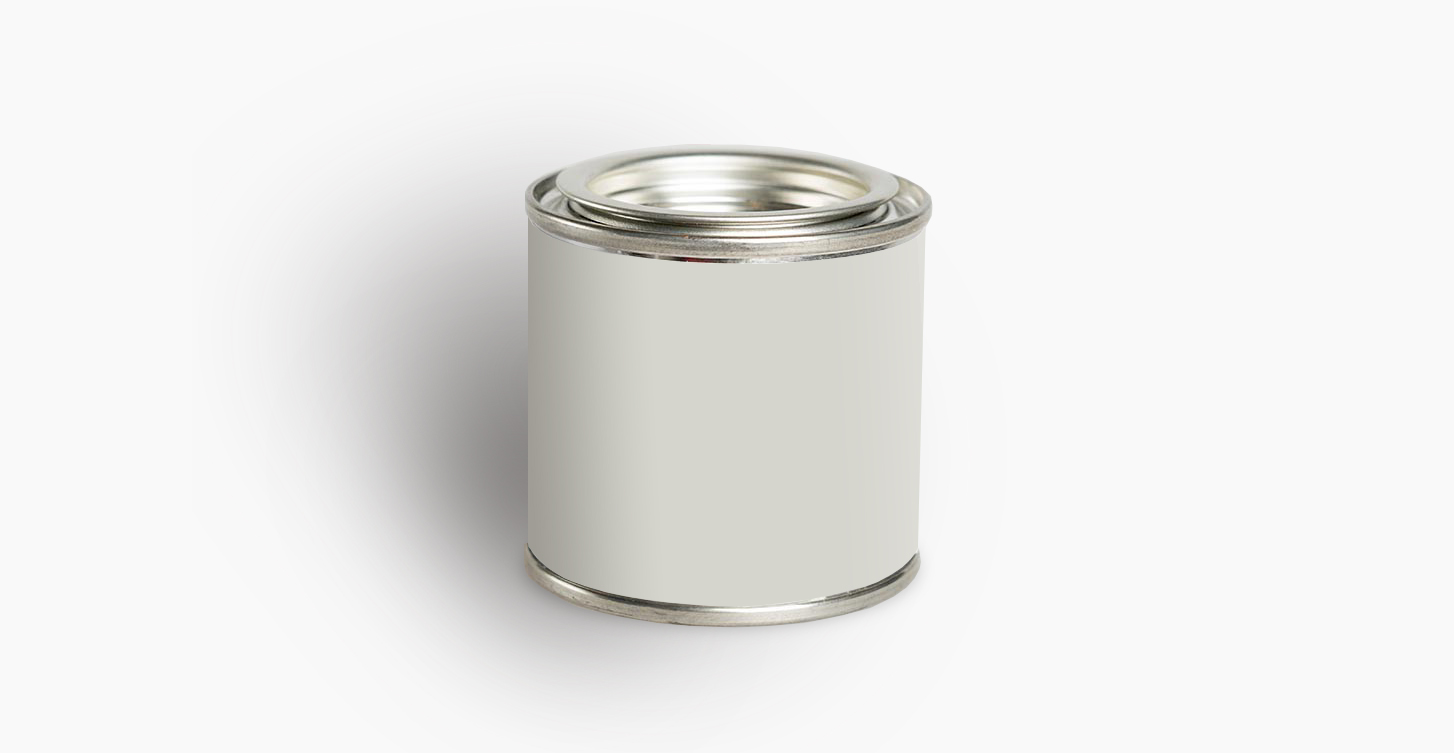
Benjamin Moore Shoreline 1471
Shoreline is a fresh color that goes hand in hand with modern farmhouse interiors that are hugely popular right now. It has a delicate tonality that makes a room feel cozy, meditative and serene. The subtle blue-green undertones compliment rich woods.
Best use: Walls
Benjamin Moore Gray Owl OC-52
Fresh and bright, this is the ultimate greige paint. It’s favorite color of a lot of decorators and for a good reason.
“This gray is super classic and sophisticated, but not boring AT ALL. It’s a very, very warm gray – meaning that it’s still a cool tone, but has more yellow in it than blue,” explains Emily Henderson.
It’s an excellent color for anywhere in the home. You can use it with confidence in the kitchen because it compliments a lot of different countertops and finishes. In fact, a favorite combination of Designer Amber Lewis is Gray Owl with Benjamin Moore’s White on the trim.
Best use: Walls
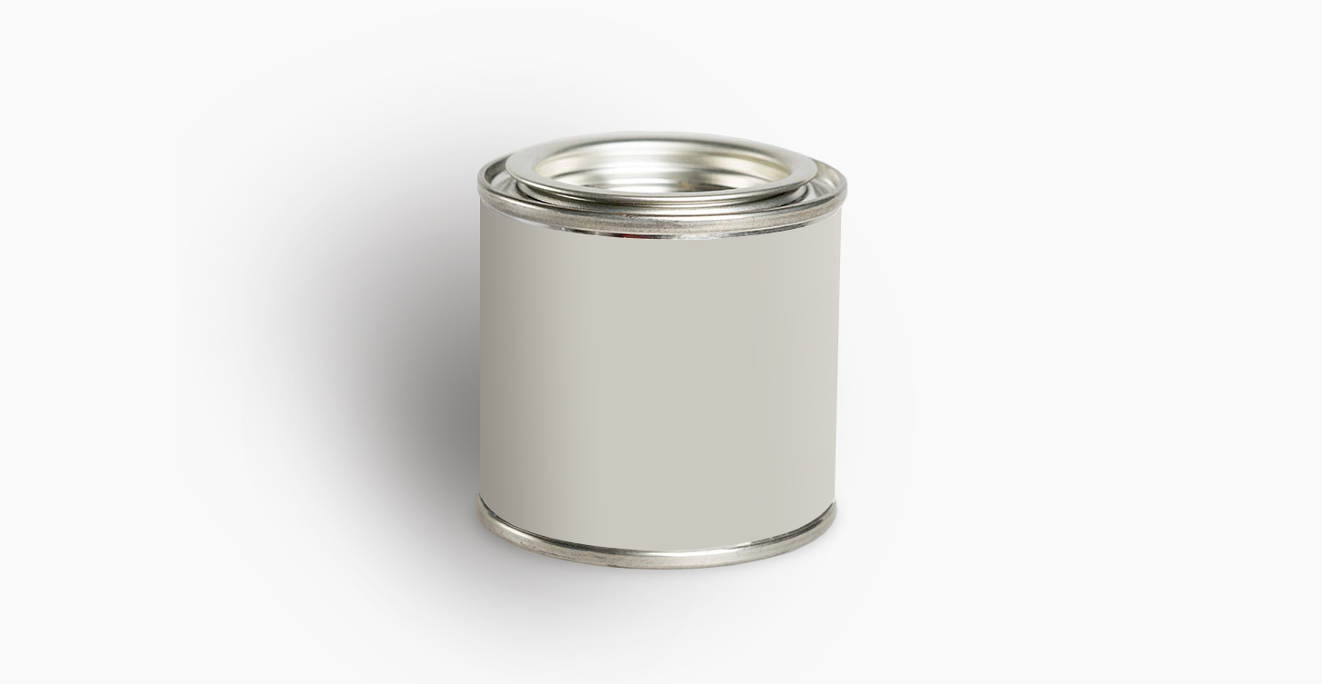
Sherwin-Williams Repose Gray SW 7015
The medium tones highlight architectural features and look pretty next to a bright white trim. The paint color is slightly warm and subtle but saturated, so it looks great with almost everything.
It’s one of those colors that gently changes depending on the time of day and the room’s lighting, which keeps things interesting.
Best use: Walls
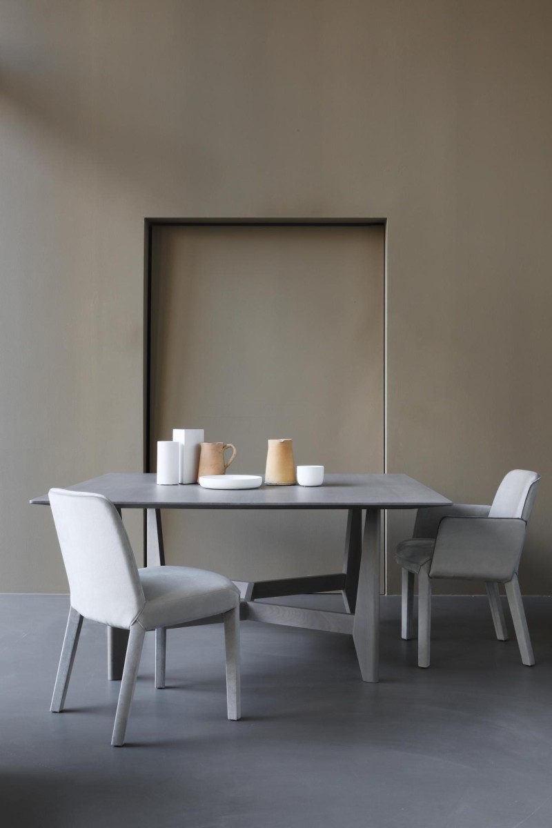
Cool Greige
Photo: Est Living Magazine
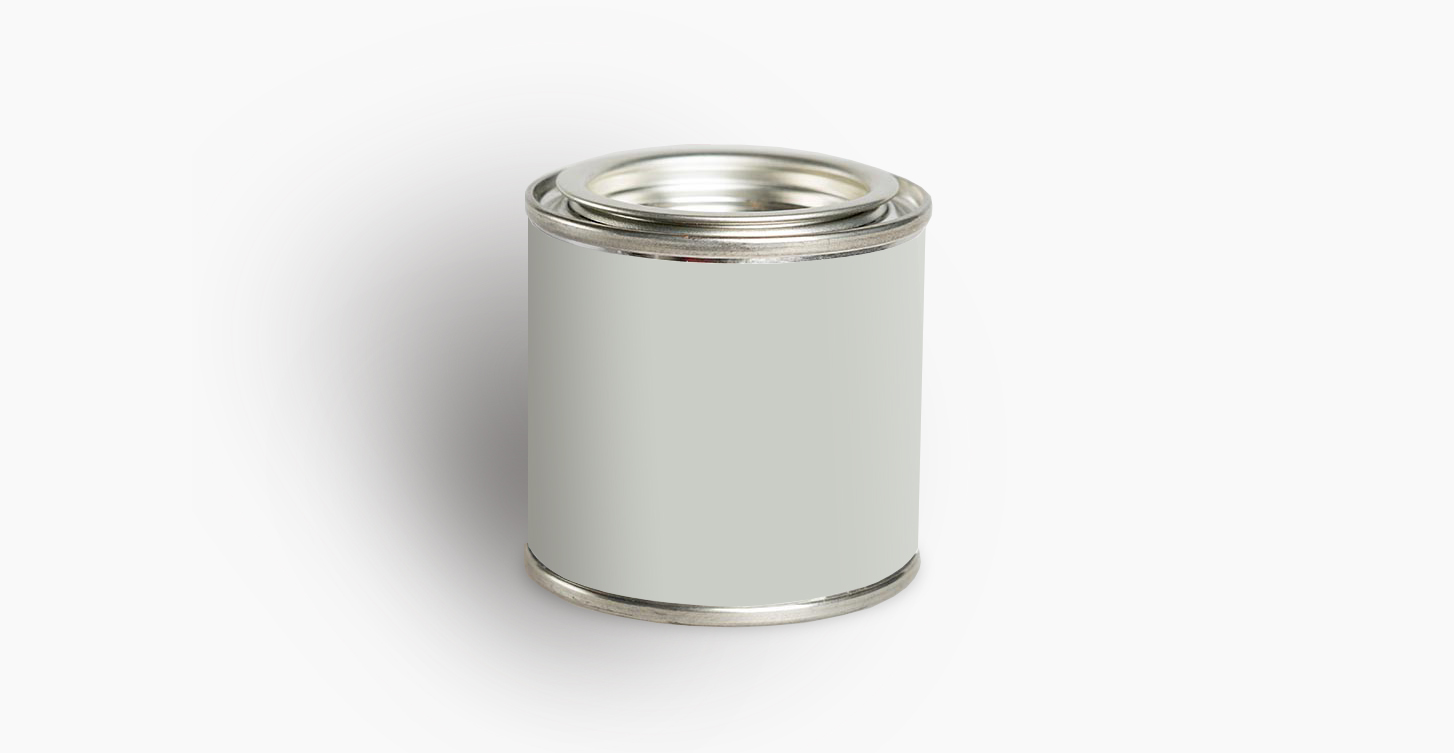
Benjamin Moore Stonington Gray HC-170
If you’re looking for a cool greige paint, your search is over. This paint has a lovely blue-green tint to it. I love the softness and chicness of this color. Designer Caitlin Murray remarks, “I’ve found that this hue looks pure and fresh at any time of day or in any type of space. It’s not too dark, not too light…it’s just right.”
Stonington Gray looks great paired with a bright white trim for a clean, modern look.
Best use: Walls
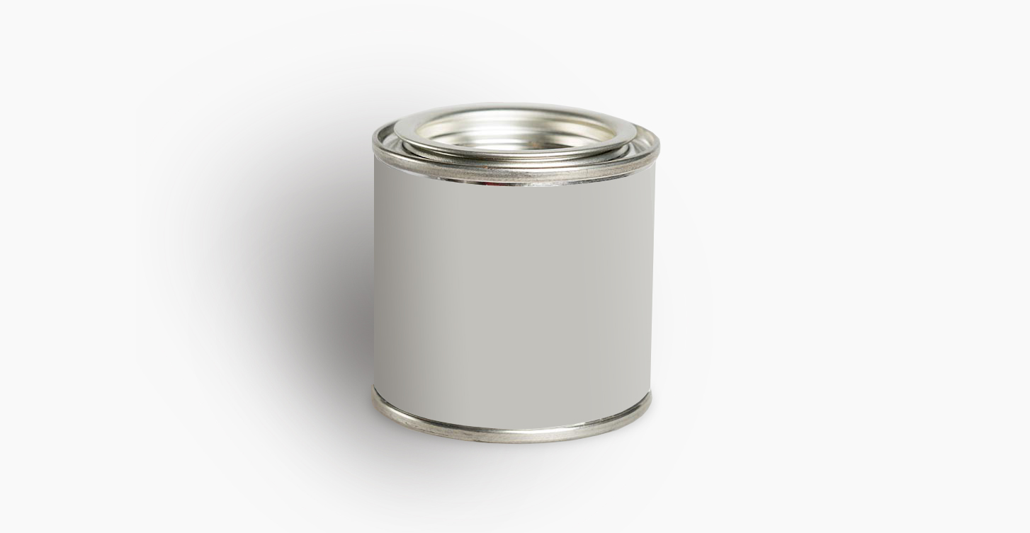
Sherwin Williams Knitting Needles #SW 7672
Greige paints (gray-beige) are on-trend this year. Looking for one for your cabinets? Not only is this paint color stunning on the wall but tested and approved for kitchen cabinets, too.
“I recently painted a kitchen Sherwin Williams Knitting Needles, a very soft gray that has great light-reflecting qualities,” explains Designer Jeff Andrews. “It’s a great choice for both cabinetry and walls.”
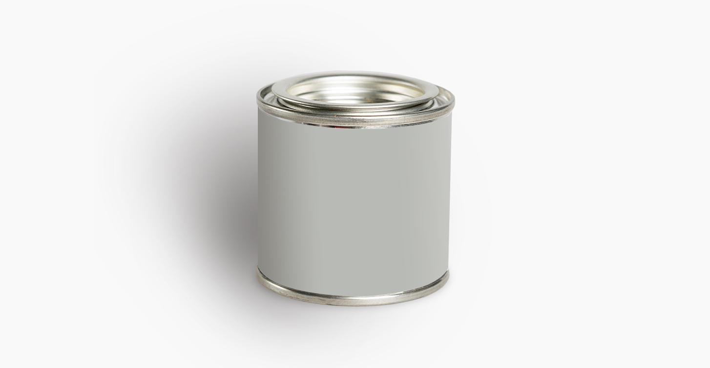
Benjamin Moore Coventry Gray HC-169
A stunning European greige paint color, it highlights architectural details while adding dramatic sophistication to tall ceilings. This lovely medium gray is on the taupe end.
It makes an elegant backdrop for many different colors and finishes. This paint color looks great with a semi-gloss finish, which adds subtle dimension to it.
Best use: Walls
Warm Greige
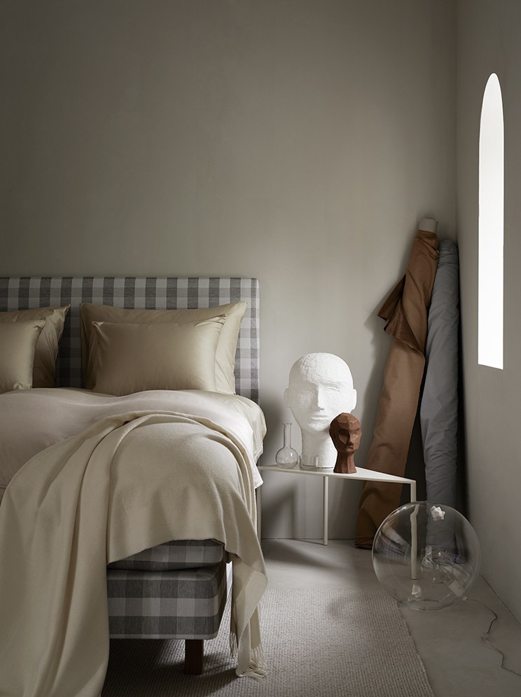
Photo: Kristofer Johnsson
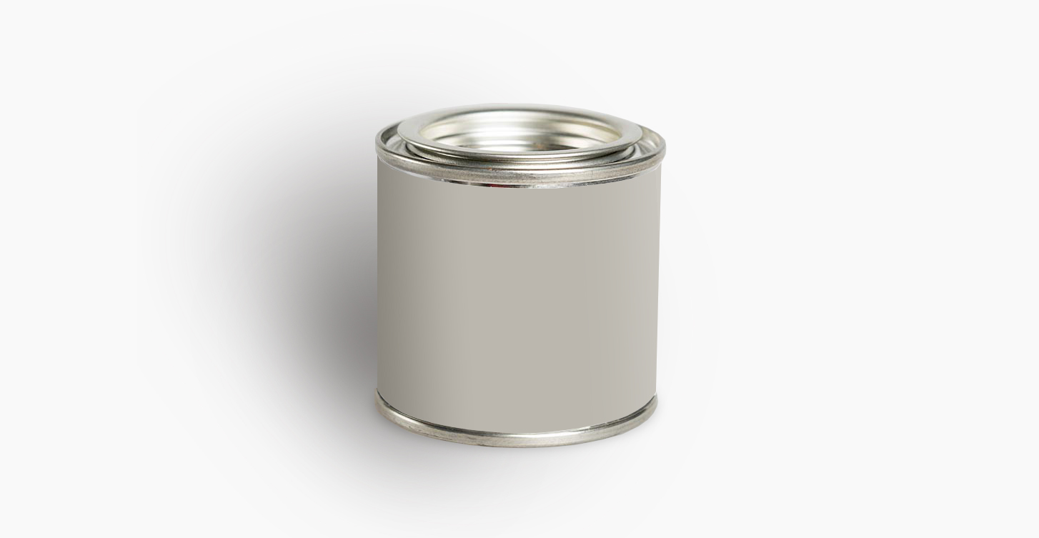
Sherwin-Williams Mindful Gray SW 7016
The taupe tones paired with the soft gray shade of this paint compliments many colors and interior styles. Depending on the location it’s painted, it can reflect cool or warm tones.
It’s a classic, stylish shade of gray that’s easy to live with and plays well with warm-toned woods. Beautiful in both matte and gloss finishes, this paint is great for adding ambiance without being too dark.
Best use: Walls
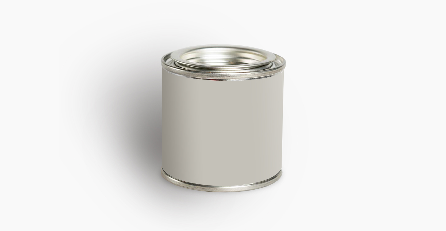
Farrow & Ball Purbeck Stone
“This color feels bright and airy during the day, but in lower light, it becomes sexier,” remarks Interior Designer Jay Jeffers. “It’s a fantastic backdrop for art.”
Gorgeous in both matte and high-gloss finishes, this paint is an excellent medium tone for adding a bit of drama. It’s a lovely understated color that’s fresh and inviting without being boring.
Best use: Walls
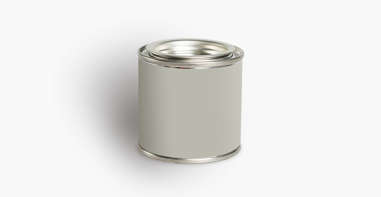
Farrow & Ball Lamp Room Gray No. 88
Timeless and fresh this soothing gray changes in the light. It’s no wonder it’s named Lamp Room Gray. It goes from a soft taupe to an elegant, luxurious stone with a hint of green undertones. Perfect for traditional spaces.
“This shade of gray is pretty because it has a little taupe in it that makes it very chic. It can be beautiful in a living room, dining room, or bedroom,” says Interior Decorator Alex Papachristidis.
Best use: Walls
Dark Greige
Photo: Piet Boon
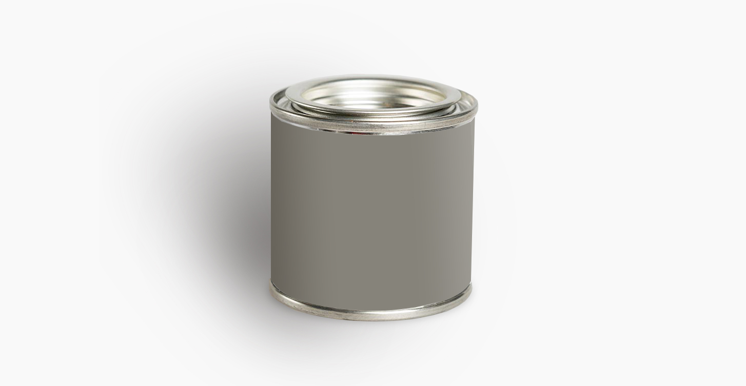
Benjamin Moore Chelsea Gray HC-168
A neutral medium toned greige paint for a moody interior that’s not too light or too dark. It has very little undertones and plays well with many colors.
Best selling author and decorator Erin Gates says, “I use this shade over and over again on cabinets and vanities because it is the perfect medium-dark gray. It has warmth, but never looks brown, and has enough pigment to make a statement without shouting. Such a classic!”
Chelsea Gray is great for casting a warm, cozy vibe while still feeling fresh and elegant.
Best use: Walls, cabinets
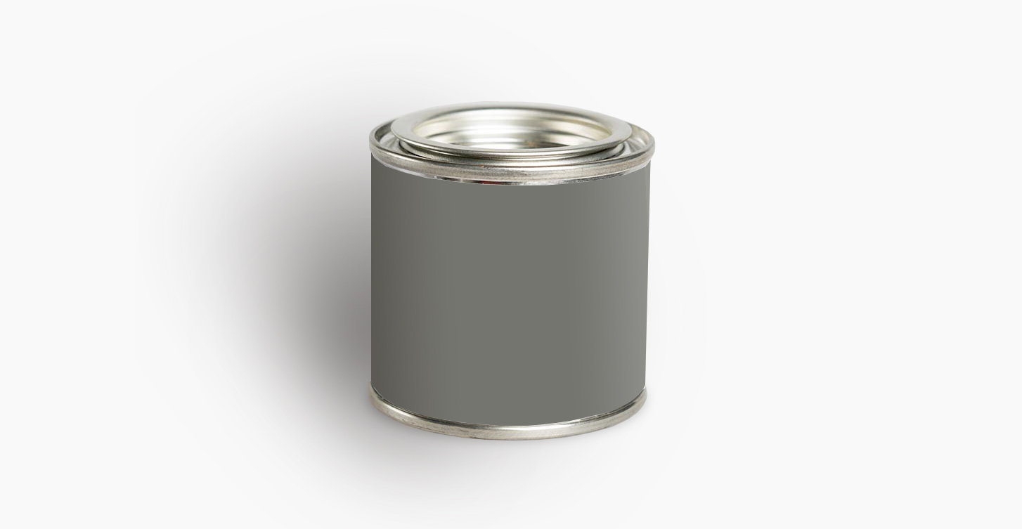
Dunn Edwards Coal Miner DET613
Beautiful stone gray with rich pigments. It is a very saturated color. If you aren’t looking for a dark room, then it might not be the best for you. But for a small space or somewhere that you are looking to bring some drama it’s such a pretty color.
Coal Miner will feel even moodier in rooms with very little natural light. This neutral greige paint looks great with a gloss for cabinets and furniture and pairs with a lot of different finishes.
Best use: Walls, cabinets
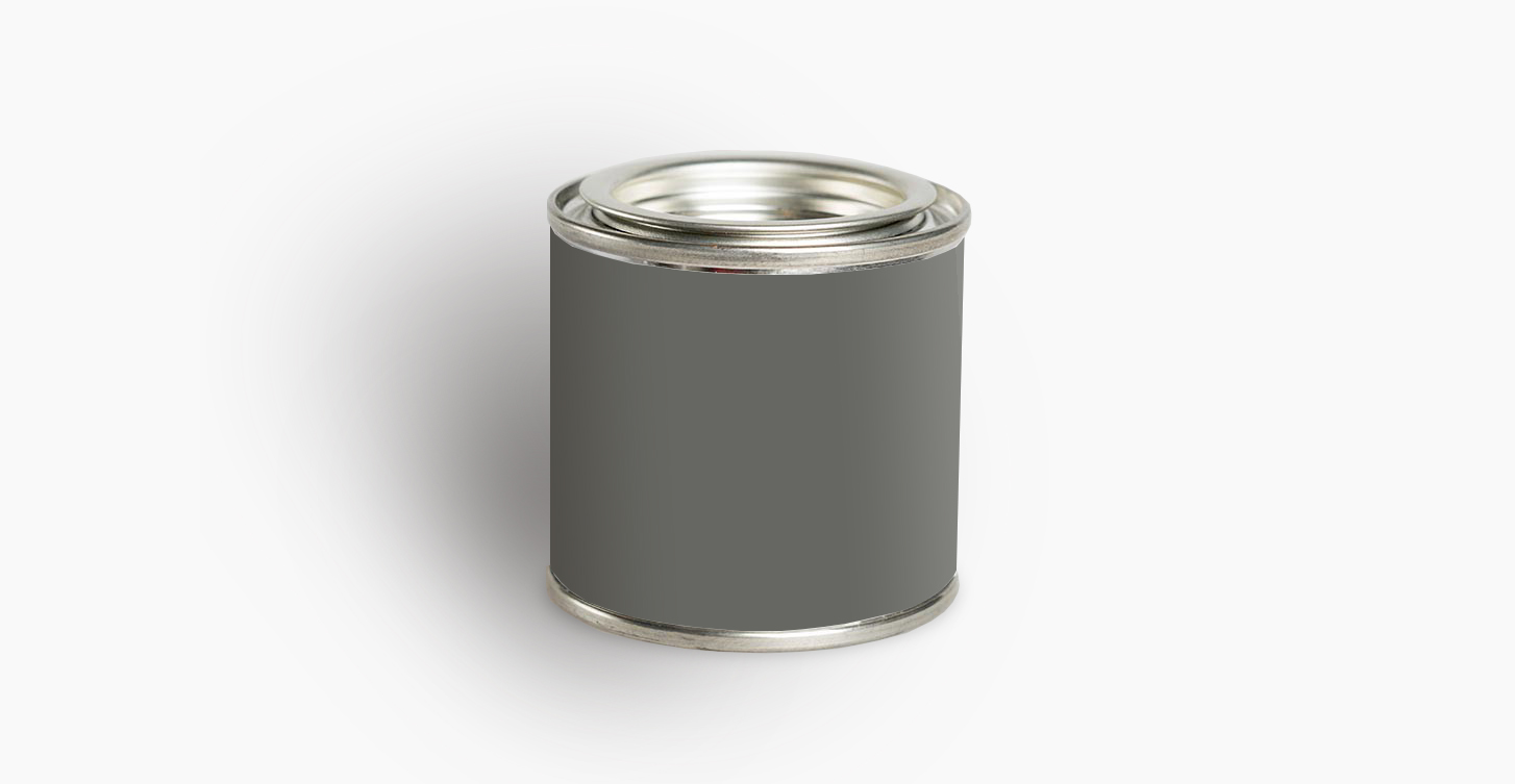
Benjamin Moore Kendall Charcoal HC-166
Rich, saturated and earthy, this paint is sophisticated. Not too dark, Kendall Charcoal is a beautiful shade for a room with a fair amount of light.
It’s a favorite of Shea McGee who says that it’s a “dark gray that looks great on walls for a moody look or great on cabinetry. Looks good time and time again.”
Best use: Walls, cabinets
FREE BONUS #2: PAINT CHEATSHEET
Take the stress out of painting with the ultimate paint cheatsheet from selecting your color scheme to painting your walls like a pro. And keep it simple, guaranteed!
After you’ve read this post, tell me: What paint color is in your home? Are there any other gray/beige shades that belong on this list?
Share it in the comments below. Your insight and ideas may help eliminate someone’s indecision and help them pick their paint color.
If you have friends, family or colleagues who are looking for a new paint color share this post with the links below.
