Cover Photo: Rodolphe Parente
When I first started decorating in Y2K (that’s the year 2000 for those that haven’t heard that term in a while), everyone was painting their homes with their favorite beige paint colors. But then, overnight it became synonymous with boring (insert sad emoji face here).
Next, it was all about gray to make your home feel up-to-date, and it’s reigned for over a decade. In fact, gray was the most searched color according to Google in 2016. But this year, beige is back! It has a more subtle shade with less yellow and more neutral. And it’s anything but plain ol’ boring.
There’s something so soothing, welcoming and luxurious about sand tones, blonds, camels, cashmere, tans, and shades of taupe.
Beige paint colors are the perfect background and like white have timeless appeal. Whether you have a monochromatic color palette or want to make your jewel-toned accents pop, beige makes the ideal backdrop.
It’s not only for your wall. In fact: it’s also trending in kitchen cabinets right now.
No matter your style from Farmhouse to Minimalism, this neutral color is versatile and works with a variety of interiors. It makes a minimal home more inviting and approachable and is considered timeless for a reason.
But with thousands of shades of beige, picking the right one can be perplexing and overwhelming. The wrong tone can change from a beautiful neutral to a surprising pink or appalling yellow once it’s on your wall.
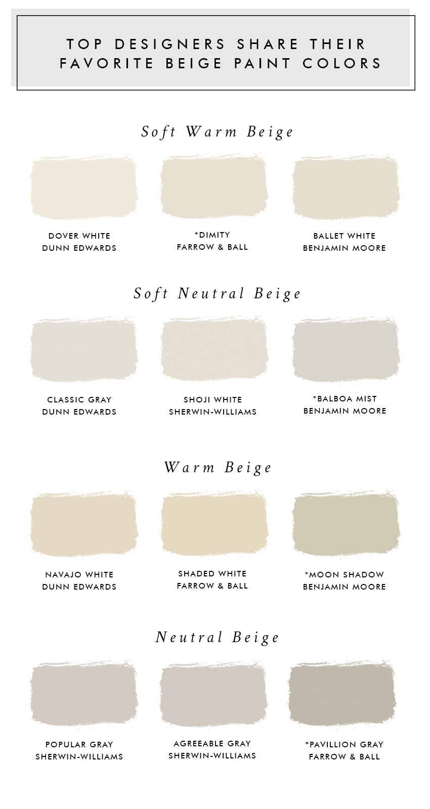
So, how do you know which paint colors to try and which ones to avoid? To help answer that question, here are the top 12 designer approved beige paint colors to get your color right the first time.
FREE BONUS #1: COLOR GUIDE
Get your copy of the 48 BEST NEUTRAL PAINT COLORS
all in one place + bonus content!
Soft Warm Beige
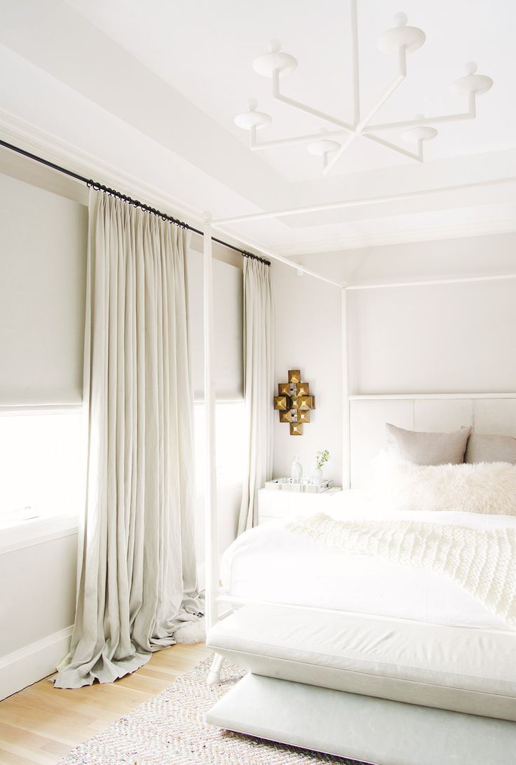
Photos: My Domaine

Sherwin-Williams Dover White SW 6385
Like many beige paint colors, this one is a versatile, soft, inviting color that is beautiful from day to night and pairs perfectly with warm finishes.
A top paint choice of Leanne Ford, she recently used this color and loved it. As she explains, “The white was perfect for the space. It felt fresh and clean but slightly more vintage. It worked incredibly well with the woods and bricks that we had throughout the house too.”
Best use: Walls
Farrow & Ball Dimity No. 2008
TOP PICK
A popular paint choice of Interior Designer Robert Passal. This adaptable hue works beautifully in any environment.
When deciding between this shade or white paint, check out what he has to say. “This is a very light beige that makes a space feel airy,” explains Passal, “while adding a level of sophistication that a plain white would not be able to achieve.”
Best use: Walls

Benjamin Moore Ballet White OC-9
A brilliant warm beige that’s a crisp white that brilliantly enhances a room’s natural light. This shade is the perfect foundation for soft, graceful spaces.
A favorite of Gideon Mendelson. He says, “This [color] has enough warmth in it to make a room feel cozy, not sterile. Sometimes it feels beige, sometimes it feels gray. It’s versatile and changes throughout the day. That’s the best part!”
It looks fresh during the day, and in the evening it feels cozier, relaxed and welcoming. This beige paint color nicely compliments warm finishes.
Best use: Walls
Soft Neutral Beige
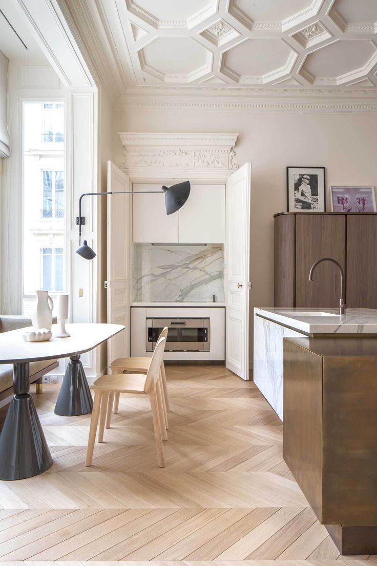
Photo: Rodolphe Parente

Benjamin Moore Classic Gray
A light, airy warmer gray with a hint of a pink undertone. “We’ve used this light gray countless times because it’s just that good! It has a warm undertone, so in some lights, it is a true light gray, and in others, it is more greige,” explains Shea McGee.
A favorite go-to for adding a hint of color and warmth and sophistication to walls.
Best use: Walls

Sherwin-Williams Shoji White SW 7042
Another designer favorite, Shoji White is a warmer, natural feeling white. This classic tone makes you think of ceramic pottery.
The super-subtle tones feel so fresh right now and offer a timeless quality that blends well with clean, crisp interiors.
Best use: Walls

Benjamin Moore Balboa Mist 1549
TOP PICK
It’s a beautiful romantic shade with subtle muted undertones. Balboa Mist looks stunning with warm wood finishes. It’s a classic neutral beige paint color that makes a wonderful backdrop for many different styles.
“Just like good fashion, this color can go from day to night with ease,” states Jay Jeffers of his favorite paint color.
Warm Beige
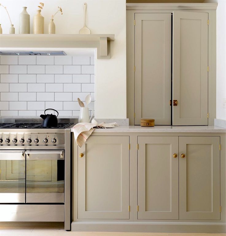
Photo: Devol Kitchens

Dunn Edwards Navajo White DEC772
Navajo White is an iconic beige paint color that’s been loved by interior designers for years. This color is great for casting a warm, cozy vibe while still feeling elegant and sophisticated. It transitions from night to day and warms up a North facing room.
Best use: Walls

Farrow & Ball Shaded White No. 201
“My go-to for paint colors Shaded White by Farrow & Ball for that European look,” says Designer Brian Paquette. Crafting a warm, comforting environment this paint color is a fabulous versatile shade.
This beige paint color highlights architectural details and adds timeless sophistication. It can make an expansive space feel cozy.
Best use: Walls

Benjamin Moore Moon Shadow 1516
TOP PICK
Moon Shadow is a favorite among designers including Nate Berkus. It’s an on-trend and relevant paint color that’s also very timeless.
Even though it has slight green undertones, it’s an ultra-usable neutral that complements a vast variety of styles and finishes.
Best use: Walls
Neutral Beige
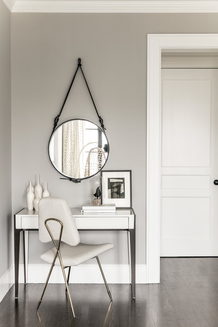
Photo: Cottage & Gardens
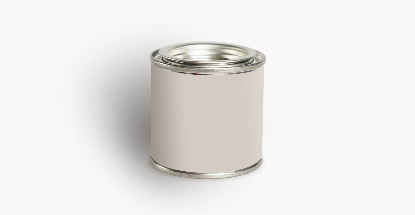
Sherwin Williams Popular Gray SW 6071
Like its name, this shade is a favorite for its versatility. Attempts to mask its true nature (more of a beige), this is warmer than a traditional gray.
Depending on where it’s painted, it can reflect the cool or warm tones. Another paint that shifts beautifully from day to night.
Best use: Walls
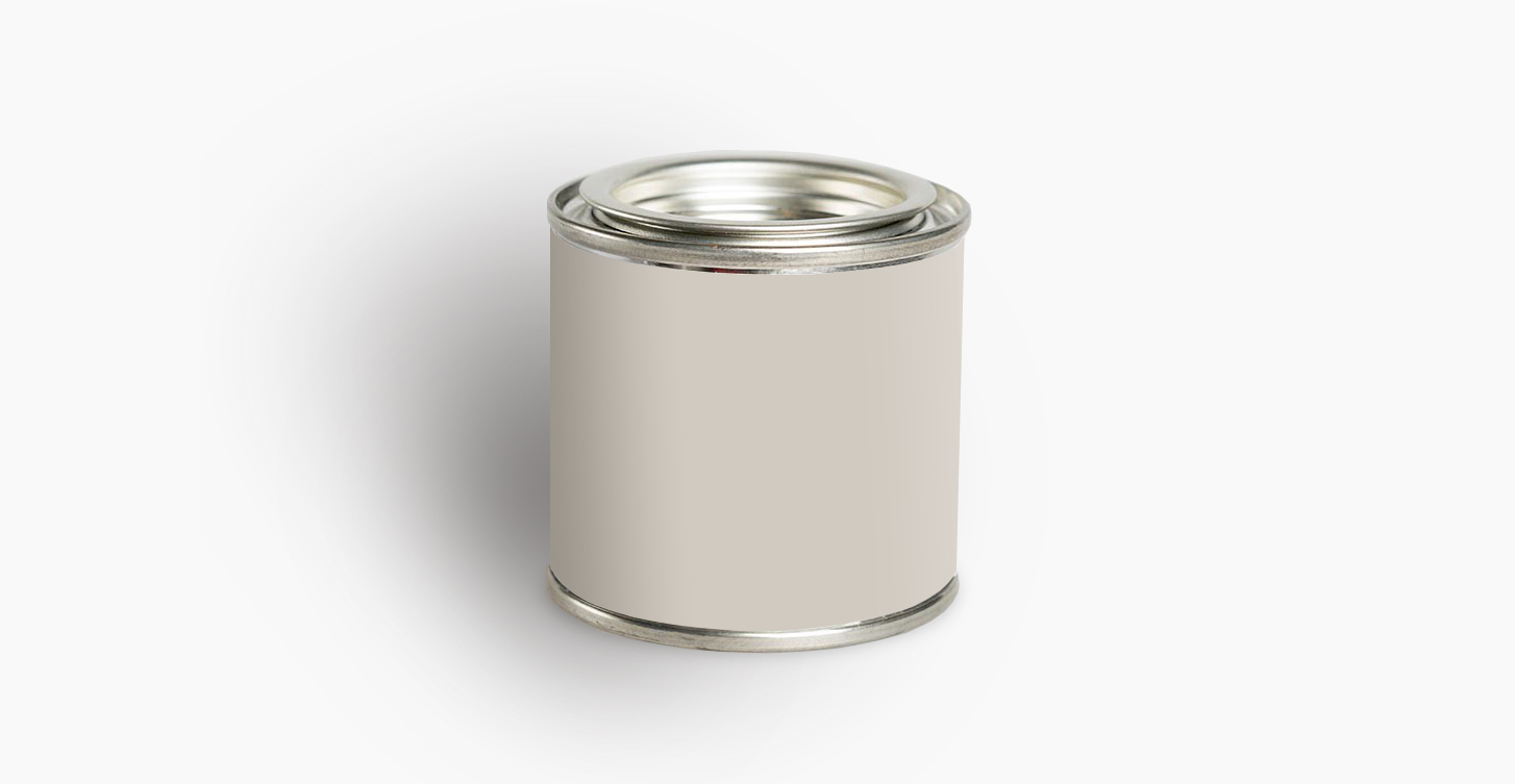
Sherwin-Williams Agreeable Gray SW 7029
“It’s faint enough to be a neutral, but saturated enough to make a difference,” says J. Randall Powers. A gorgeously neutral, Agreeable Gray is exactly that – agreeable. It’s a classic color that creates a cozy canvas for your furniture and decor.
You get the crispness of gray without the cold blue undertones. This beautiful color does well in any interior but is especially lively in a “well-lit” room.
Best use: Walls
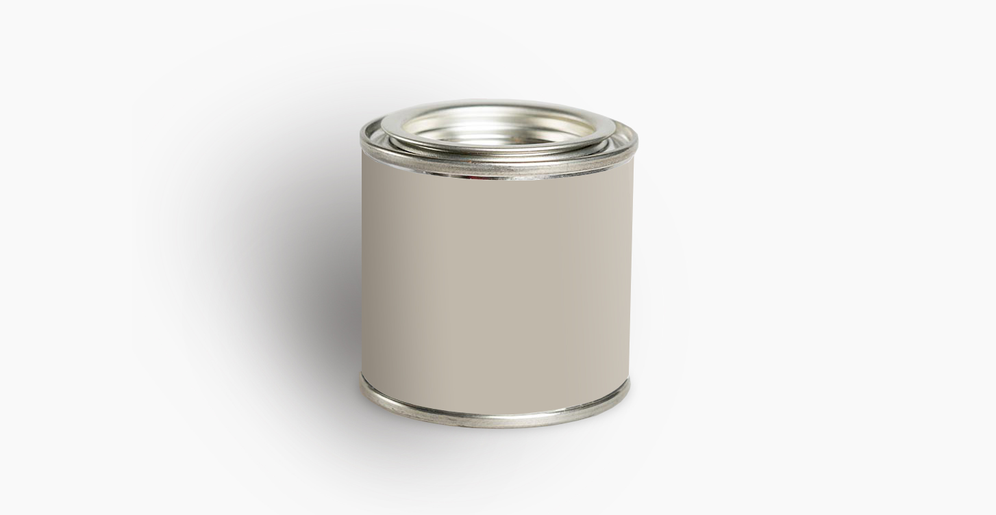
Farrow & Ball Pavillion Gray No. 242
TOP PICK
Soft, light yet saturated, this paint color brings depth and interest to most any setting. It has a warmer feeling and isn’t stark like a traditional gray. The soft warm undertones work well with a multitude of finishes.
Best use: Walls
FREE BONUS #2: PAINT CHEATSHEET
Take the stress out of painting with the ultimate paint cheatsheet from selecting your color scheme to painting your walls like a pro. And keep it simple, guaranteed!
After you’ve read this post, tell me: What paint color is in your home? Are there any other beige shades that belong on this list?
Share it in the comments below. Your insight and ideas may help eliminate someone’s indecision and help them pick their paint color.
If you have friends, family or colleagues who are looking for a new paint color share this post with the links below.
