Cover Photo: My Scandinavian House | Emily Henderson
I was recently reading an article, How To Vacation Like A Millionaire (It’s All In The Planning). The idea was that by planning what you want you’ll maximize your opportunities and vacation… as it says, like a millionaire. It made me think of arranging furniture when decorating, more specifically a floor plan.
Here’s the reason:
The secret to getting the most from your home (and making it look like a million bucks) is to create a floor plan… or furniture layout.
A furniture layout it one of the most important elements of your design, whether you’re decorating for a new apartment, refreshing a room or creating a home from the ground up. Because, let’s face it, not all square feet are created equal.
A floor plan will help you arrange your furniture to get the most from your home.
But, figuring out how to arrange your furniture can be complicated. You’re thinking, “How on earth am I going to fit all my furniture in my new living room.” You’re struggling to find the flow of your space. Or you’re at a complete loss at how to furnish your new home or apartment.
Here’s the great news:
Arranging your furniture doesn’t have to be so challenging.
With these 7 designer tricks at hand, you can turn your house into a comfortable, inviting and well-designed home. All while maximizing your layout, knowing exactly what furniture you need, and avoiding overcrowding or under furnishing your room.
When you’re ready to arrange your furniture, Pottery Barn Room Planner is an amazing tool to create a floor plan.
Ready to take your home to the next level? Let’s dive in.
FREE BONUS: DECORATOR'S PLAYBOOK
Get your free copy of the complete guide to decorating and take your home to the next level, guaranteed!
1. Begin with function
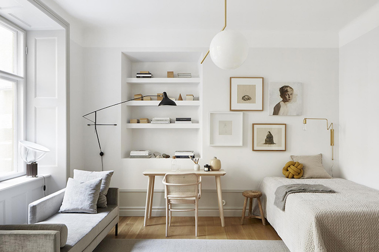
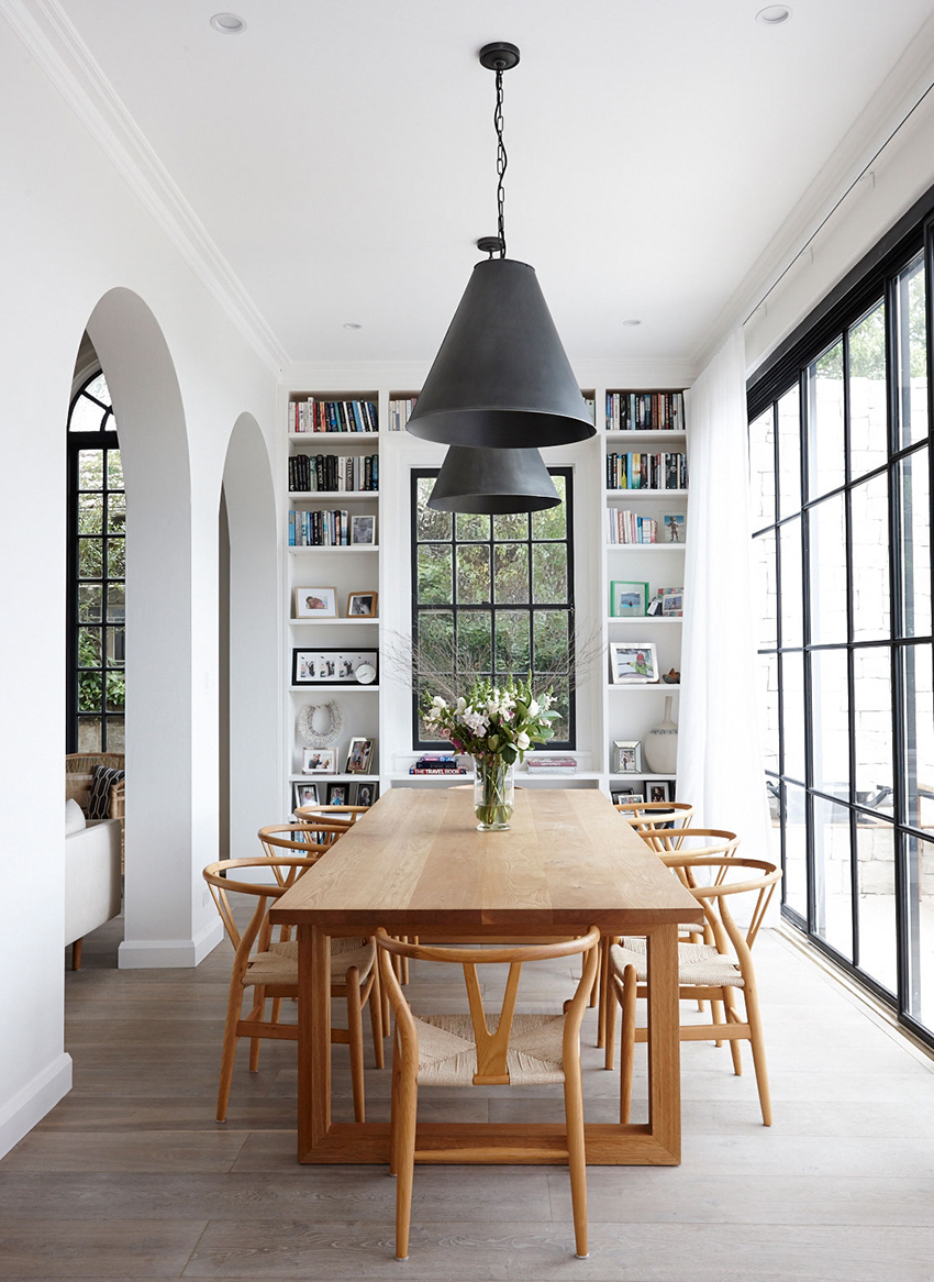
Photo: My Scandinavian House
The secret to arranging your furniture and maximizing your layout is to start with its purpose. For example, instead of assuming you need a sofa, chair, coffee table and media console, for your living room, consider how you want your space to function.
Ask yourself these questions: How will you use the room? What kinds of activities will you be doing there? How many people will it need to accommodate? This will dictate the type of furniture you’ll need and the size.
For example, do you love to entertain guests and host parties? Create a layout that functions for entertaining. This could mean planning for a credenza that hosts a mini bar and larger seating area that invites conversation.
Do you prefer movie nights instead? Start with a media center and plan your seating to optimize your viewing experience.
The #1 secret to a great layout is this: Use the right size furniture for your space.
This is especially important when you have a small space for different purposes like a bedroom/office combo or living/dining space.
Once you understand how you want it to function, use those requirements to create a list of furniture for your room layout.
It’ll save you time and help you make better and more confident decisions. That way you’re not trying to squeeze a bunch of furniture that doesn’t fit your lifestyle into a room that isn’t suited for it.
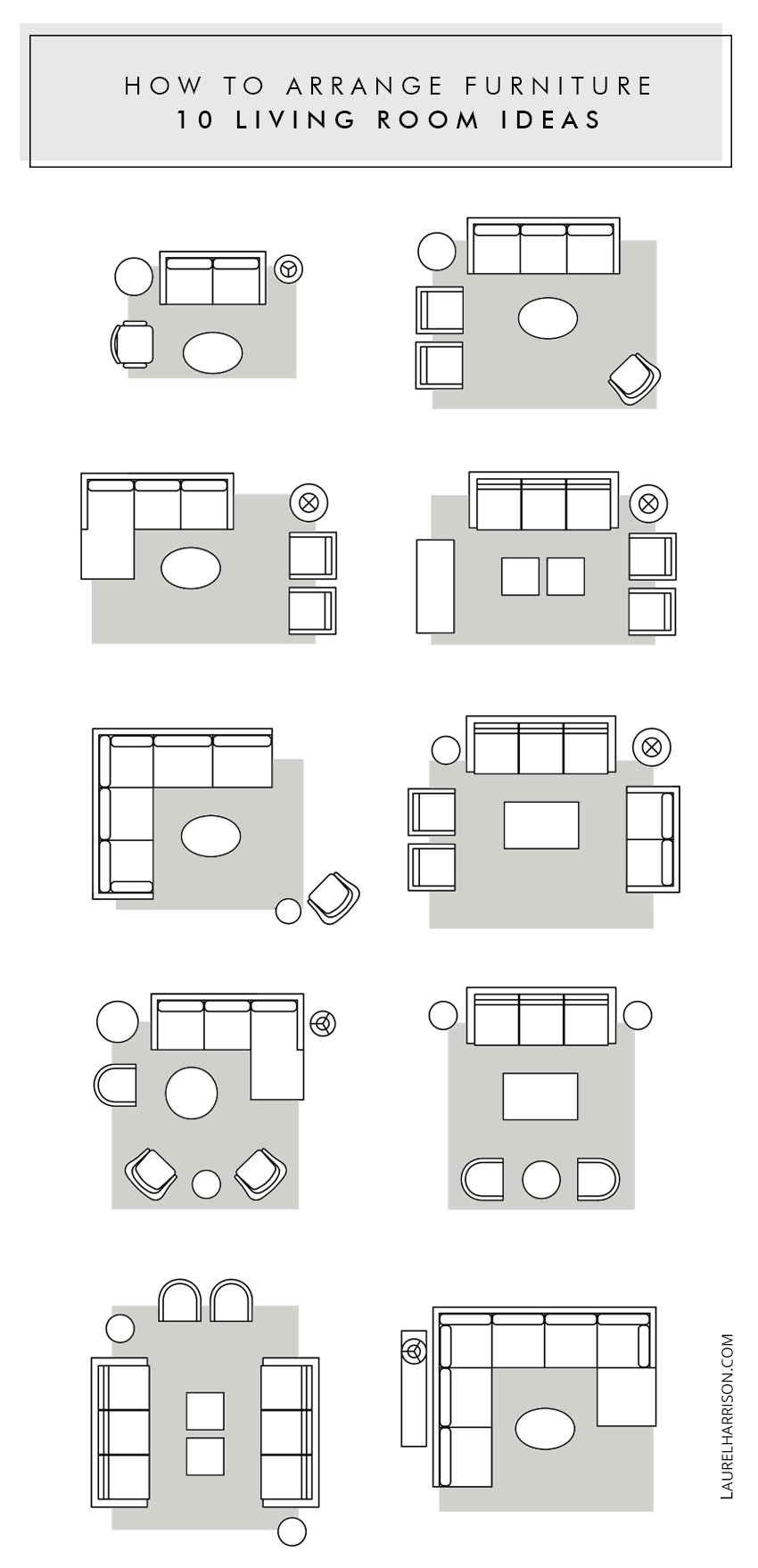
Furniture arrangement ideas to get you started
(Psst…don’t forget, you can pin it for later)
2. Define your focal point
Photo: Studio McGee
What is the first thing you notice when you walk into a room? Is it the fireplace? Or a fabulous painting or oversized lighting? Whatever it is…that’s a focal point. Like in photography, you should have something you want to focus on or highlight. It’s the same in decorating.
We’ve all walked into a room but didn’t notice anything. That’s because the room lacked a focal point which is boring. Or worse the emphasis was on one of the least attractive elements in the room like a cluttered table or electronics.
To create a focal point, pick one main feature and style around it. This will influence the way you see and experience your space.
The best part:
A well-defined focal point not only gives your room interest but makes it so much easier to layout. Once you know your focal point, you can use it as a guide to planning your layout.
How To Find Your Focal Point
1. Natural Focal Point
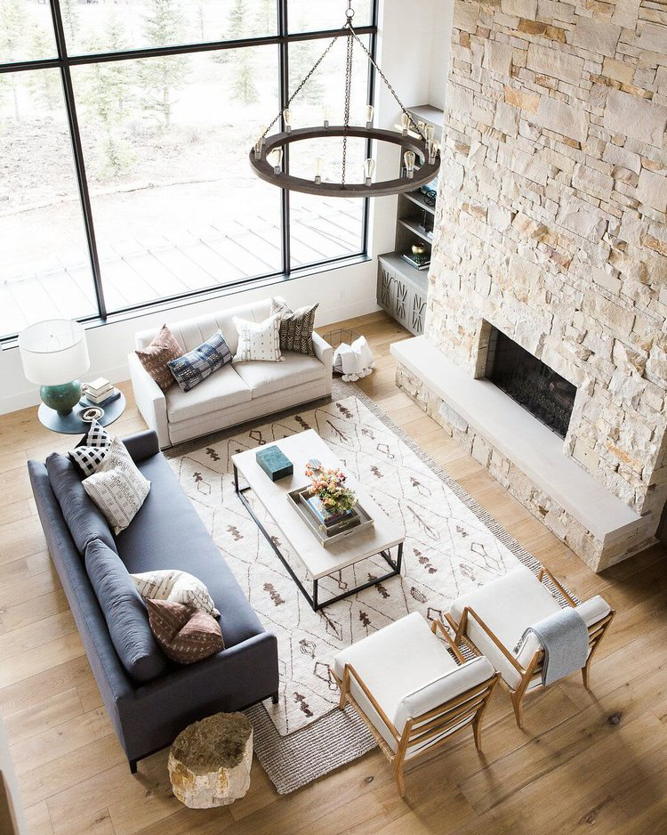
Look around the room to determine the main feature. This could be a natural element such as a fireplace, picture window or built-in bookcase.
Do you have a great view? Let the placement of your window dictate your layout meaning focus your furniture toward the window.
What about a fireplace? This makes an ideal focal point. But if you aren’t in love with your fireplace or other architectural feature use it as a natural backdrop instead.
2. Create your own
If your room doesn’t have a natural focal point or if you prefer, you can create your own. Large furniture, vertical elements, lighting, and artwork are ideal for highlighting. For example bookshelf, bed, large-scale painting, gallery wall or even a beautiful light fixture.
Showcase it by moving it to a prominent place. For instance, if you want to use a room for reading, make the bookshelf your focal point and direct your furniture towards it.
3. Pick only one
What if you have two focal points such as a window and fireplace? If this is the case, then you want to pick the main one that you want to highlight. This way you have clarity and avoid overemphasizing too many elements which can be overwhelming.
Ask yourself these questions. Which one is the most interesting? Which one naturally draws your eye? Focus your design around your answer.
The trickiest situation that happens the most is this:
Sometimes you have a natural feature such as a fireplace and another element like a flat screen that both draw your attention.
Resolve the fight between the two elements by placing them side by side (best solution) or the flat screen above the fireplace. But make sure you have heat protection, and it’s not too high if you do that.
3. Let the space be your guide
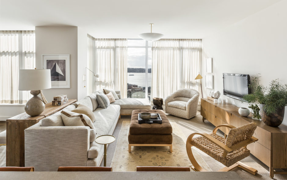
Photo: Brian Paquette Interiors
Work within the confines of the existing architecture instead of fighting against it. This means pay attention to the location of your windows, doors, columns, cabinetry, and fireplace.
For example, if you have a full height window – especially if it’s a beautiful view – don’t place your furniture right in front of it. Instead, use the window to let the natural light in.
This also means to plan for the rooms adjacencies, and the traffic flows from one room to another. Think about arranging functions within your space as close to each other as possible. For example, placing a dining table closer to the kitchen means fewer obstacles in the way.
Don’t forget to provide enough clearance to walk around and open cabinets and doors. As a guide, leave 3 feet (90 cm) in traffic areas and front of doors.
4. Make your design choices look intentional
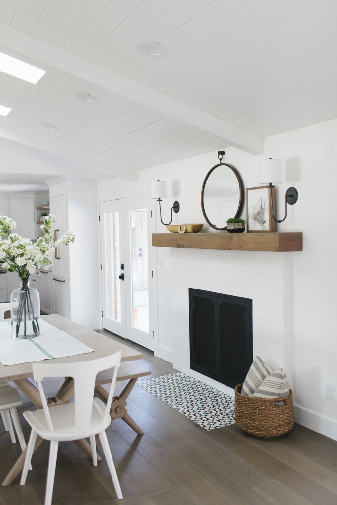
Photo: House of Jade Interiors
You might be thinking, “Yeah, that’s great to let my space be the guide. But what if I have a bad view, unattractive fireplace, or an ugly column?”
The answer is simple:
As Interior Designers, we know that no matter what the challenge, that you should always make your design decisions look intentional. Contrary to belief avoiding what you don’t like, emphasizes it.
What that means is to either use the element in your design or hide it. For instance, in a plan, you can integrate a column by placing furniture next to it, or a not-so-fabulous fireplace by using it as a backdrop.
Although more of a decorating tip, a simple way to downplay or hide something is to paint it the same color as the wall, so it blends in. You can also cover it up with the back of furniture or artwork. If it’s an unattractive view, use bold curtains to draw your eye away from the view or plants inside or outside to camouflage it.
5. Incorporate negative space
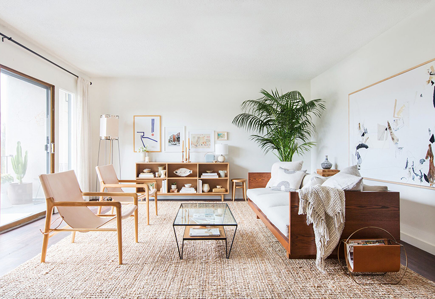
Photo: Emily Henderson
Not every corner needs something in it, and not every part of the room needs filling. It’s about spacing out your room and considering how the furniture works with each other.
A well-designed room is not just what’s in it, but also what’s not in it.
Negative space means the blank spaces in your arrangement, where there’s no stuff. It makes a room feel balanced and avoids it from feeling cramped, small and overwhelming.
Negative space emphasizes the right elements and adds much-needed calmness and balance to a room.
As Coco Chanel said, “Before you leave the house, look in the mirror and take one thing off.” Apply this same rule to your arrangement. To find the right balance, you want to pair objects with the empty spaces. Look at the design and decide if something really needs to go in that area or if it could be left blank.
As a rule of thumb, don’t put bulky furniture like sofa or table in the corners. They’re better with lighter objects like baskets, small chairs or plants. This helps make it feel more balanced.
Pro tip: Don’t group all your furniture in one area or on one side of the room. This will make your space feel off. Instead, draw a line in the center both vertically and horizontally of your floor plan. Then balance the elements in the room.
6. Give your furniture breathing room
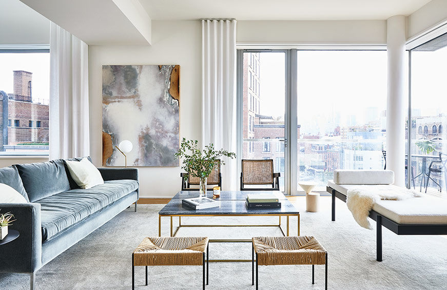 Photo: ASH NYC
Like finding the right balance by incorporating negative space, you also want to give your furniture some breathing room. Placing furniture up against the walls makes a room look smaller rather than larger.
But there’s an easy fix:
Give your room ‘breathing space’ by pulling the furniture away from the walls like shown above. To create conversational groupings, place the seating together and off the walls. For a more intimate, and purposeful seating arrangement, point them towards each other.
This invites people to join in the conversation. So, don’t be afraid to place furniture in the middle of the space (or where it looks best) and off the walls.
7. Use proportion & scale
Photo: The Grace Trails
Proportion and scale are the holy grail of design. But what are they exactly?
Proportion is how objects relate to one another and the room. The scale is the size of the objects in the room. To use these two design elements to your advantage, think about how many objects you’re putting into the space and how they relate to each other.
No matter what, remember this tip: Use the right scale for furniture and rugs in your room.
One of the biggest decorating mistakes is furniture that is too large or too small for its space.
The sofa is usually the worst offender. Choose either large scale or apartment sized furniture. This will help you from overcrowding or under furnishing your space because of the wrong size furniture. I go over these elements and much more in my playbook.
You can get it below:
FREE BONUS: DECORATOR'S CHECKLIST
Download your copy of the ultimate checklist to stay organized. These are the EXACT steps that I use to create my client’s dream homes that you can use to decorate from start to finish.
After you’ve read this post, tell me: Where there any Ah-ha moments that you discovered in this post? Or is there anything else that you want to add?
Share it in the comments below. Your insight and inspiration may help someone have a meaningful breakthrough.
If you have friends, clients or colleagues who are struggling with creating a layout, share this post. They’ll thank you for it!
