Cover photos: Farrow & Ball
Which color should I paint my room? It’s a question everyone asks themselves time and again, yet it remains equally daunting every time. Painting is a cost-effective way to transform an entire room, but it can go wrong quickly when a grey appears lavender or a tan changes to pink.
Painting is a super involved process from narrowing down your color to painting your room, and if we’re being honest we want the perfect color that we’ll have a crush on for years to come.
But even if you’re sticking to white, nailing down the perfect shade requires a bit of know-how.
So what if I told you that you no longer have to worry about picking the wrong paint color?
That’s right!
Follow these 4 essential rules to choose your paint color like a pro:
Rule #1: Know your style
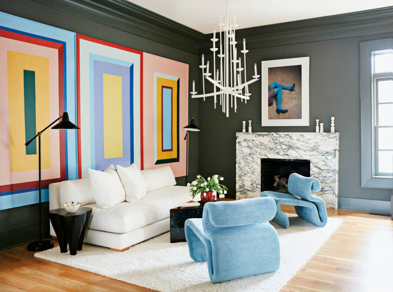
Photo: Domino
If you aren’t happy with your paint color, it could be for this simple reason: that it doesn’t match your decorating style.
Think about it:
Color doesn’t just make a room prettier but is meant to complement and reinforce your design style. Your style is a reflection of you, what you like and the home where you live. Without defining your style, your choices can go in a lot of different directions.
What do you do?
Start by looking at what you gravitate towards, such as the colors and style of your wardrobe. This will help you to narrow down your paint color choices so that it feels relevant to you.
As a rule of thumb when it comes to white paint, warmer tones are more traditional and cooler shades are more modern.
The first step ( and rule #1) to selecting your paint color is to look for color inspiration that matches your style.
FREE BONUS: PAINT CHEATSHEET
Take the stress out of painting with the ultimate paint cheatsheet from selecting your color scheme to painting your walls like a pro. And keep it simple, guaranteed!
Rule #2: Consider the mood
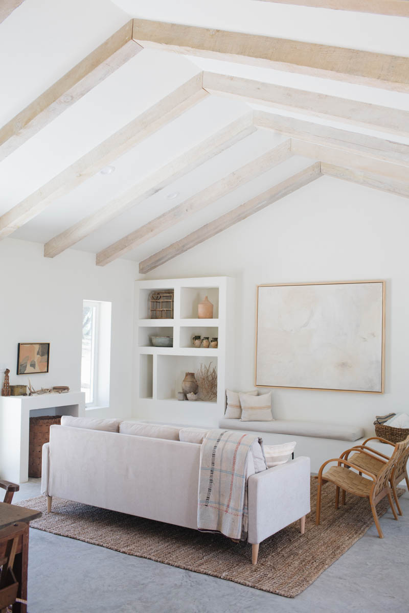
Photo: Kate Zimmerman Turpin
Raise your hand if you’ve thought about choosing a paint color because it’s your favorite. We all have! But the problem is that there could be a disconnect between the color and the mood you want to evoke.
Color plays one of the most essential roles in shaping how we feel in a space.
Every shade changes the ambiance of a room and arouses a different emotion in us. Color is a powerful decorating tool that can conjure the look and ambiance that we want when used correctly. It can make a small room feel bigger, or a spacious one feel more intimate for example.
Let’s take a look at the psychology of paint colors:
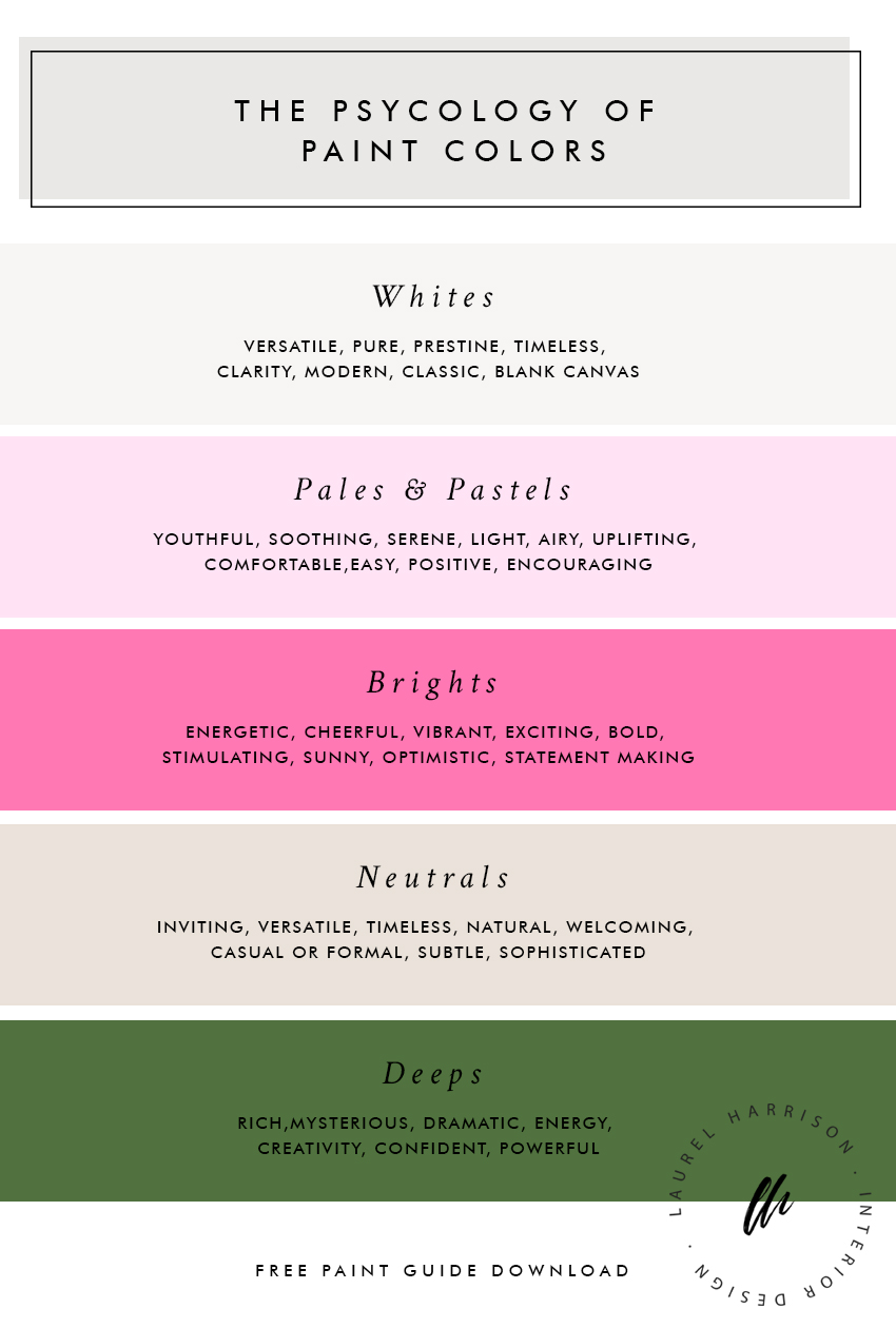
Whites
Anything but boring, white is incredibly versatile. Pure and pristine these timeless colors offer a blank canvas to express your style while cultivating clarity. Whites can easily feel modern, classic or anywhere in between making it the ideal color for all interior styles.
Pales/Pastels
Youthful, soothing and serene, pale hues are easy to live with. Their light, airy qualities are uplifting and comfortable. They’re positive and encouraging while enhancing other colors in the room.
Brights/Saturated
Energetic and cheerful, these vibrant colors provoke excitement. Anything but calming, these colors are bold and stimulating. They’re sunny, optimistic and ideal for making a statement.
Neutrals
Inviting, versatile and timeless, these colors are inspired by nature. Colors in this family can be warm or cool and create a welcoming atmosphere in both casual and formal spaces. Best of all, these subtle, sophisticated hues transition beautifully with shifting daylight.
Deeps
These rich, mysterious hues bring depth and drama to a room. They’re the opposite of understated. These hues are powerful and can fill a room with energy, creativity, and confidence.
If you’re not sure if you’ve found your perfect match, check the name of it. Then see what mood it conjures up.
A lot of thought and research goes into naming paint colors, knowing they can sway customers toward one shade or another. It’s another way to see if it’s a good match for you.
Rule #3: Pay attention to undertones
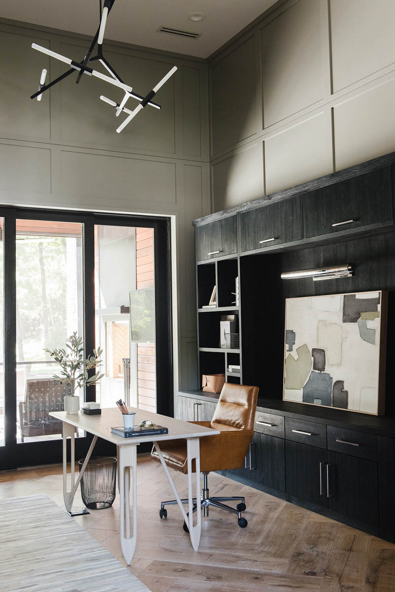
Photo: Studio McGee
The most popular paint colors are neutrals and for a good reason. It’s a classic foundation for your home and makes everything look more luxurious. But thinking that white is just a white or that a beige is the same as every other is one of the biggest reasons a paint color doesn’t work.
Did you know?
Neutrals are the hardest color to choose because of the undertones.
FREE BONUS #2: COLOR GUIDE
Get your copy of the 48 BEST NEUTRAL PAINT COLORS
All the best neutral paint colors. All in one place!
Learning more about undertones and how to identify them will help you master your paint color, whether it’s a neutral or another color. What is an undertone? An undertone is an underlying color that may be hidden within the main color. Each paint color has a unique undertone due to the colors used to create it.
Other things to watch out for are adjacent finishes and their underlying color when compared to a paint color.
For example, painting an orange wall next to a grey tile can make the tile appear pink because it’s intensifying the undertones of red in the tile.
Here’s the trick:
Testing colors in your home is the best way to discover any troublesome undertones that might cause a problem with your color scheme. Always check your paint, next to other finishes in the room to see if a color is lurking that you weren’t aware of.
To find the base color of a lighter shade, look at the darkest color on the paint strip.
What color does it lean more towards – red, yellow, green, or blue? Pro tip: To figure out the actual color and undertone, hold the paint chip next to a pure white like a piece of white paper.
The best part?
Once you’ve figured out the undertone, it’s going to be a lot easier to narrow down your choices.
Rule #4: Pay attention to light
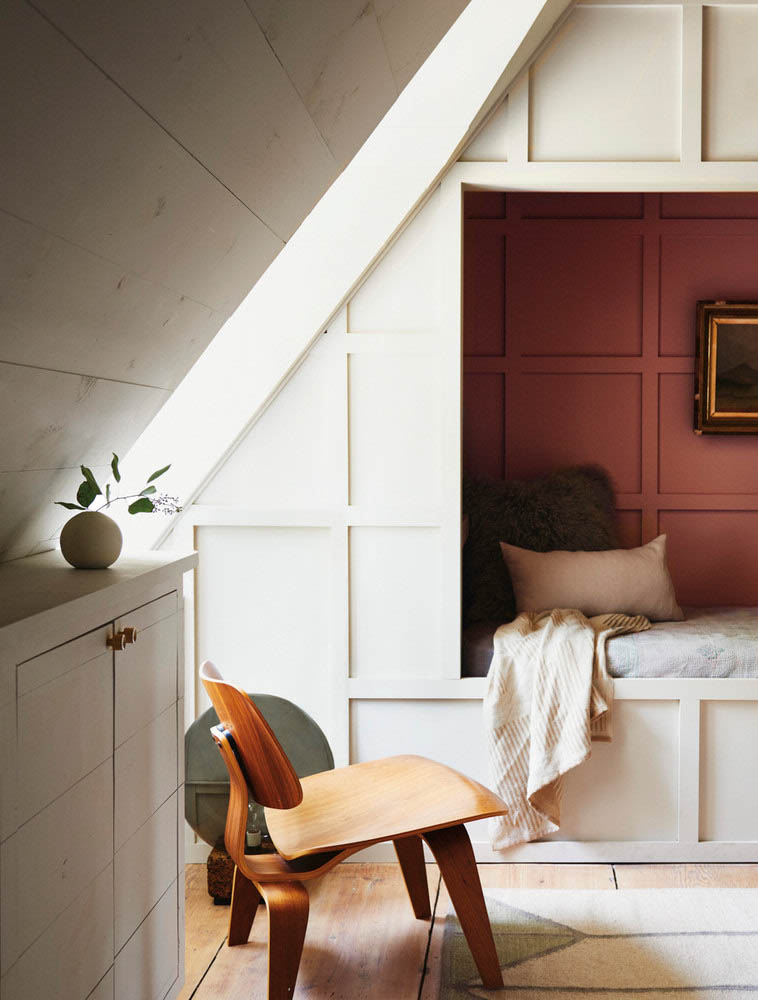
Photo: Domino
To choose your paint color, you must pay attention to the lighting in the room. Lighting in a room changes many times throughout the day and comes from two different sources: Natural light from the sun and artificial light from light bulbs. Each type of lighting affects your paint color.
The tricky part is that natural light isn’t consistent and depends entirely on the time of day, different seasons, weather, and the direction of your room.
That said…
Take a look around your home at different times of the day and notice how the color changes. Think about how different your home looks in the morning versus in the evening and on a sunny day versus a cloudy one. This is an example of why lighting is such a crucial component of your paint color.
Follow these 3 lighting factors:
1. Room direction
First, think about what direction your room is facing. The quality of the natural light will depend on the size of the windows, the direction of the sunlight, and the time of day.
For example, it could be direct or diffused light. Direct light creates drama and intrigue, while diffused light is calm and restful.
Pro tip: To find your window direction use the compass on your smartphone and face the window. The direction the compass shows is the direction of your room.
Let’s find out which colors are best:
North
The sunlight is diffused, less direct and more consistent and gives off a slightly greyed, cooler color. The paint colors that work best are warm, saturated or light colors. Warm hues make space feel more inviting. Saturated colors have a nicer tone than muted colors in this light. Lighter colors brighten the room. But a word of caution, whites tend to turn dreary and dull. For that reason, a warm, bright white is best.
Best paint colors: Warm, brights or pale colors
East
East room has sunlight that is brightest in the morning becoming softer and more muted throughout the day. It’s warmer and more yellow before noon, then turns cooler later in the day. When selecting your color, it’s important to think about what time you’ll use the space. If you’re using it throughout the day, any color is suitable. However, if you plan on using the room later in the day or evening, choose a warmer palette to offset the cooler afternoon light.
Best paint colors: Any color, warm for afternoon use
South
Southern-facing rooms are the sunniest place in the home and get more light throughout the day with direct light at midday. The warm, bright light renders colors accurately and intensifies them, bringing out the best in any color. Paint colors that excel in these rooms are cool, dark or soft. Cool shades balance the yellow of the light. While dark colors are more accurate and appear brighter than in any other room. Unless you want your room to feel energetic, avoid bright colors and use softer colors instead to offset the intensity of the hues.
Best paint colors: Cool, deep or pale colors
West
The sunlight changes dramatically throughout the day and is strong and warm, especially in the afternoon. Evening light in these rooms has a rich gold-orange hue, while sparse morning light can make colors look dull. As the light varies drastically, you want to consider when you use the room. Any color is suitable if you’re using it throughout the day. If you are using a room mostly in the afternoon, balance it with a cooler paint color when warmer tones are more intensified. If you only use the room in the morning, warmer tones can be more inviting.
Best paint colors: Any color, warm for morning use, cool for afternoon use
2. Time of day
Time of day matters when it comes to determining paint color. As the sun moves across the sky, it can drastically change the paint color in your room.
In other words…
You might love the color in the morning, but in the afternoon, it’s changed substantially.
For this reason, evaluate your paint samples at different times of day to see how the color appears in the light.
So, here’s what you do:
Move the paint swatches around to different places in your room. Or you can also paint multiple samples on various sections of the walls, as another option.
Pro tip: samples should be at least 24”x24” (60×60 cm).
Also, pay attention to the different parts of the room that have direct versus indirect light. Dark colors will be duller in these areas and lighter colors will appear brighter.
3. Type of lightbulb
One of the most critical steps to making sure you like your paint color is to look at in your home under artificial light. It’s important to remember that the paint sample will look different than how you see it in the store because it’s under different lighting.
The best part:
You have control over this type of lighting. Instead of only looking at the type of light bulb (like most people), pay attention to the color temperature and the light level (lumens not watts).
Make sure your lighting is in place before choosing your paint color. Having your fixtures and bulbs in place can help you decide which color will work best for you.
Pro tip: Select a “bright/cool white” light bulb color. It sets an inviting atmosphere and an ideal mood for any type of space.
Now that you know the rules for choosing paint color like a pro, put it into action with this checklist:
FREE BONUS: PAINT CHEATSHEET
Take the stress out of painting with the ultimate paint cheatsheet from selecting your color scheme to painting your walls like a pro. And keep it simple, guaranteed!
After you’ve read this post, tell me: Where there any Ah-ha moments that you discovered in this post? Or is there anything else that you want to add?
Share it in the comments below. Your insight and inspiration may help someone have a meaningful breakthrough.
If you have friends, clients or colleagues who are struggling with selecting their paint color, share this post. They’ll thank you for it!